

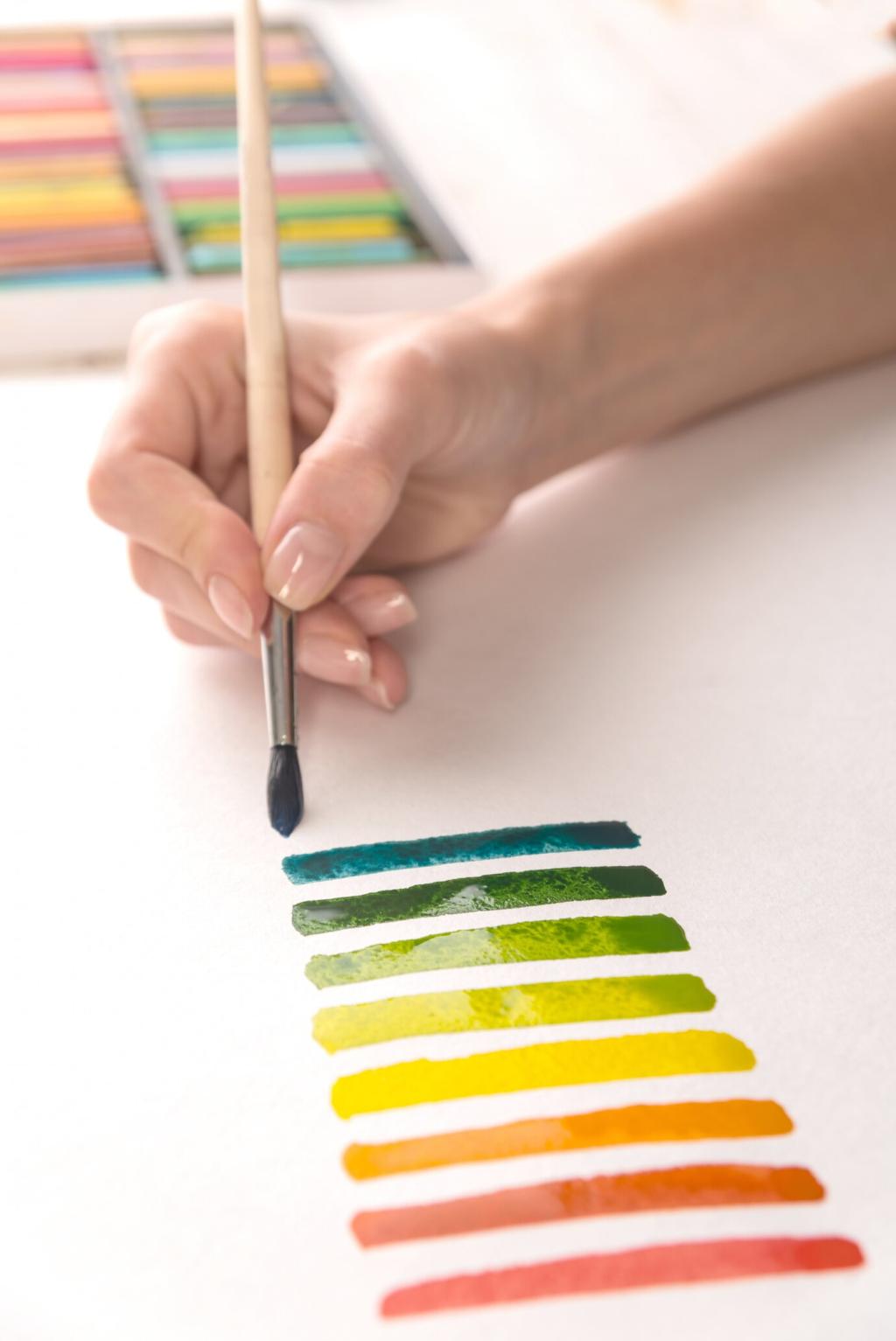

Finishes and Materials: How Surfaces Play with Light
Matte hides flaws but absorbs light, softening color. Satin adds gentle reflection for lively neutrals. Semi-gloss and gloss bounce light, amplifying color and creating hotspots. Use higher sheen on trim to frame walls elegantly, and be mindful of glare where direct light hits surfaces.
Finishes and Materials: How Surfaces Play with Light
Velvet deepens shade and shows directional highlights, linen scatters light for a relaxed feel, and polished stone brightens nearby colors. Wood species and stains influence warmth, especially under 2700K bulbs. Build material boards to see how lighting shifts the combined palette in real context.