
Bold Meets Calm: Combining Neutrals and Bold Hues in Decor
Today’s theme: Combining Neutrals and Bold Hues in Decor. Welcome to a space where quiet, grounding tones meet unapologetically vibrant color. We’ll share stories, practical methods, and creative prompts so you can craft rooms that feel collected, confident, and completely you. Subscribe and join the conversation as we experiment together.
The Role of Neutrals: Calm Frames for Courageous Color
Visual Rest and Rhythm
Neutrals act like silence between musical notes, letting the bold hues shine without shouting. Beige, taupe, greige, and soft gray create visual rest that guides the eye, builds rhythm between focal points, and keeps even daring palettes surprisingly livable day after day.
Choosing the Right Neutral Family
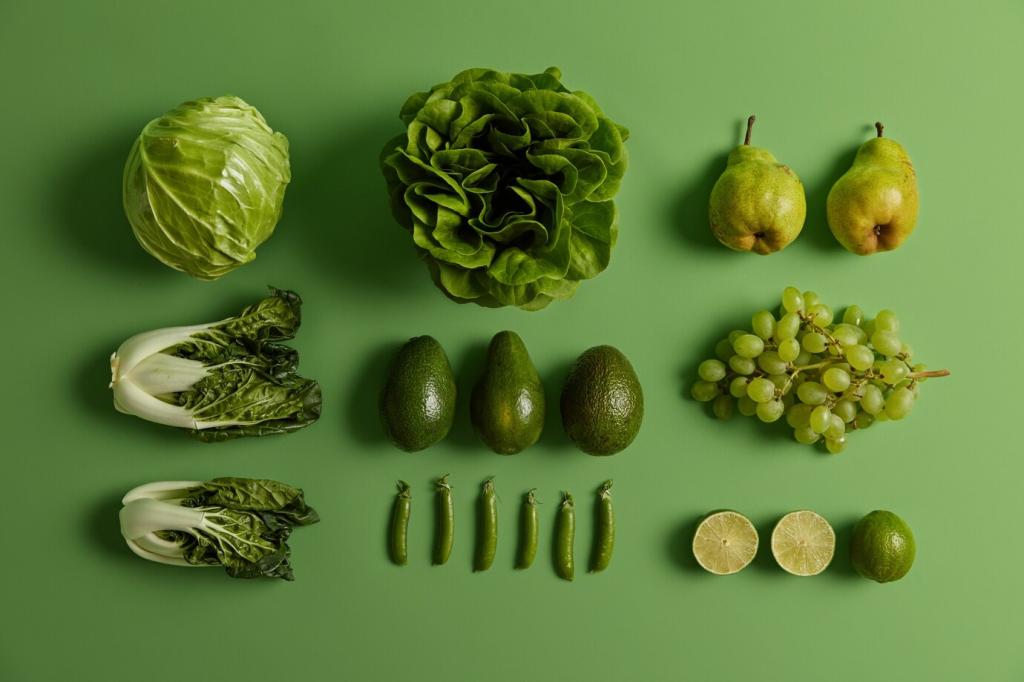
Warm whites and creams flatter spicy reds and terracotta; cooler grays and charcoals sharpen teals, cobalt, and fuchsia. Hold swatches against your flooring and trim to see undertones. If wood reads orange, a cooler neutral can balance it; if flooring is cool, try buttery neutrals.
Three Questions to Anchor Your Palette
Ask: What must feel calm? Where should energy peak? How will light shift across the day? Write quick answers, then test one neutral in three spots. Share your notes with us in the comments, and compare insights with fellow readers experimenting this week.
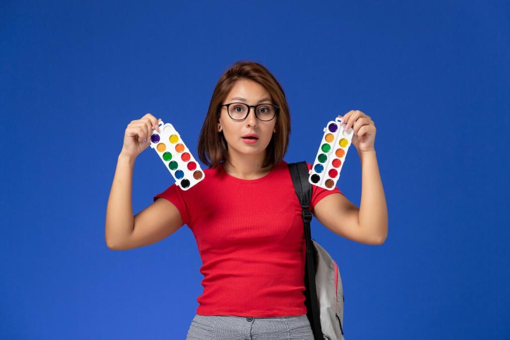
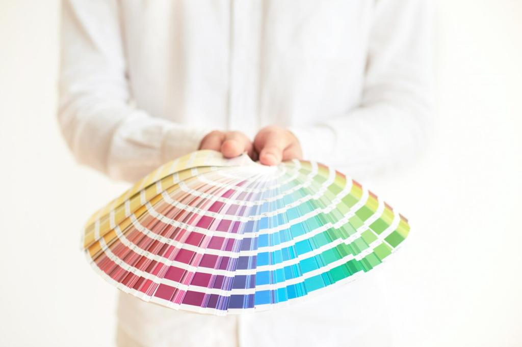
Selecting Your Statement Hue with Confidence

Find a Color Story in Daily Life
Look around: a subway poster’s electric blue, a market’s ripe mango, or your favorite scarf after a rainy walk. One reader chose emerald after a hike through mossy pines; the memory made that color feel timeless. What everyday moment is calling your palette forward today?
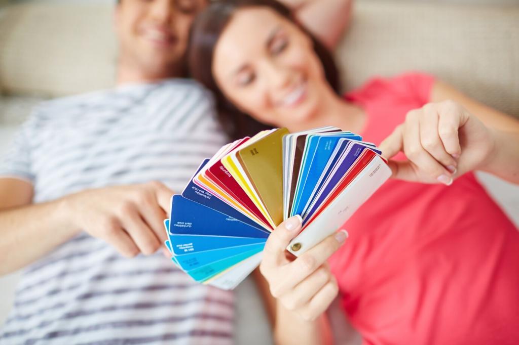
Test Saturation the Smart Way
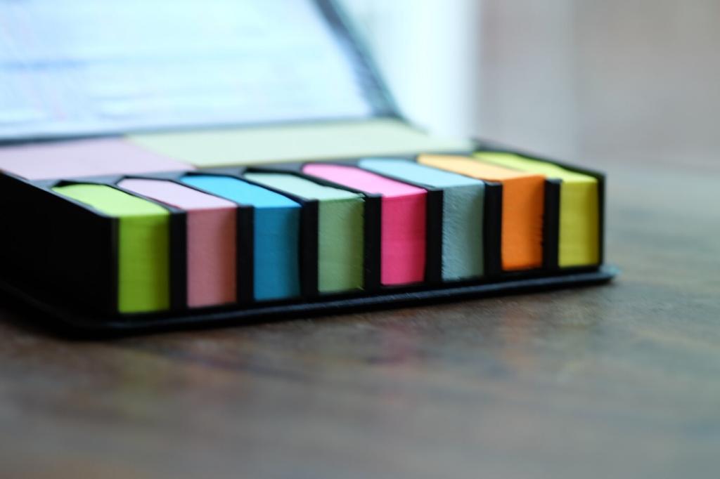
Before committing, try peel-and-stick samples, colored paper, or a borrowed throw pillow. Observe morning, noon, and evening. High saturation sings on small accents; mid-tones suit larger surfaces. If a bold hue feels too loud, try its grayed cousin for richness with calmer, versatile vibes.
Share Your Signature Pop
Tell us your chosen statement hue and why it matters. Is it cobalt, marigold, or raspberry? Post a snapshot or describe your test swatches. Your story might inspire our next palette breakdown and help someone else finally pick the color they’ve been avoiding.
Balance by Numbers: 60–30–10, With Personality
Classic Ratio, Real Homes
Try 60 percent neutral walls and large pieces, 30 percent supporting tones like wood or woven textures, and 10 percent bold color. It works because it sets priority and focus. Adjust gradually: 55–35–10 can fit smaller rooms or spaces with busy architectural details.
Accent Placement Strategies
Cluster accents for impact: a lampshade, artwork, and throw sharing the same bold hue read intentional, not random. Consider one high-focus element—a chair or niche—then echo the color twice more. This triangulation guides the eye and keeps your palette coherent across the room.
Weekend Balance Challenge
Move three colorful objects into one zone, photograph, then spread them across the room and photograph again. Which image feels calmer yet still exciting? Post your side-by-side in the comments. Noticing how distribution changes mood is the quickest way to master proportions at home.
Matte vs Satin vs Gloss
Matte walls swallow light, calming saturated colors; satin adds soft glow; gloss turns hues punchy and reflective. If your bold tone feels too strong, choose matte and pair with nubby linen. Want extra drama? A gloss side table in the same hue becomes jewel-like.
Pattern Scale that Plays Nicely
Large-scale patterns make bold color feel intentional; small repeats can jitter visually. Mix one large pattern, one medium, one micro. Keep at least one pattern in a quiet neutral so the bold hue doesn’t fight for attention on every surface. Edit, then breathe.
Layering Tactile Neutrals with Fearless Color
Combine oat-toned boucle, natural oak, and putty leather with a single saturated accent, like paprika velvet. A reader layered clay pottery, stone coasters, and linen curtains before adding a magenta vase—suddenly the color felt artful, not loud. Try it and share your layering wins.
Light Changes Everything
Daylight and Direction
North light cools colors; south light warms them. In west-facing rooms, bold hues intensify toward sunset. Tape sample cards near corners, windows, and hallways, then check at breakfast and dusk. If your neutral reads pink unexpectedly, pivot to a greener-gray to steady the palette.
Nighttime Lighting and Color Temperature
A 2700K bulb deepens reds and warms creams; 4000K sharpens blues and can flatten cozy taupes. Mix sources: a floor lamp, task light, and dimmable overhead lets your bold accent glow without glare. Test bulbs for a week before deciding, then commit confidently.
Document and Decide
Photograph the same wall at three times of day. Note how your statement hue and neutral shift. Keep a quick diary, then choose finishes that favor your favorite moment. Share your photo grid with our community—your experiment can help others decode their lighting puzzles.
Start with camel velvet sofa and warm white walls, add cobalt club chairs and a single cobalt print. Ground with jute, add brass for warmth, and echo blue in a small vase. Tell us: would you risk a cobalt lamp, or keep the color on textiles only?
Layer cloud-gray walls, oatmeal linen bedding, and clay terracotta lamps. Introduce one bold marigold throw for sunrise optimism. Keep nightstands pale wood so the color breathes. If marigold feels too hot, swap for saffron pillows. Share your bedtime palette for calm, restorative evenings.
Ivory cabinetry, mushroom-toned backsplash, and matte black hardware set the neutral stage. Paint bar stools olive and place a matching herb pot on the sill. Under-cabinet warm LEDs enrich both tones. Post your countertop snapshots—does your olive read earthy or elegant under task lighting?