Feel Your Space: The Psychology of Color in Interior Design
Chosen theme: The Psychology of Color in Interior Design. Step into a home where hues guide emotions, habits, and daily rituals. Explore how color choices can calm, energize, or focus your life—and share your color journey with us to inspire others.
How Colors Shape Mood at Home
Warm, Cool, and the Comfort Spectrum
Warm colors like terracotta, coral, and butter yellow often feel welcoming, intimate, and social, nudging conversation to flow. Cool tones such as misty blue and pine green can slow the heart, quiet the mind, and support recovery after busy days.
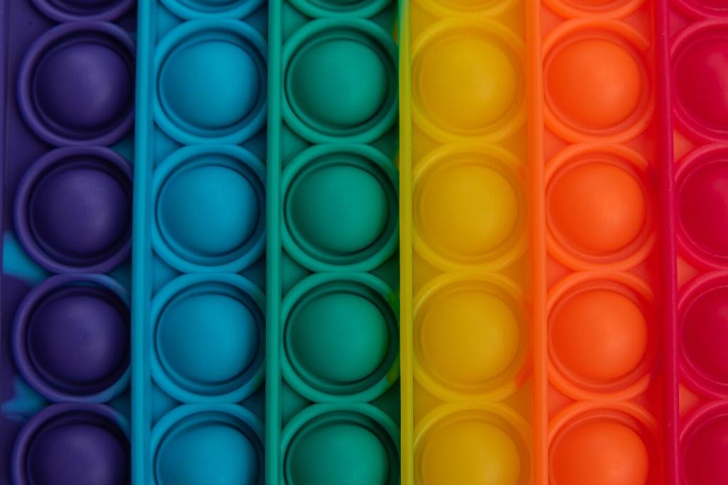
Saturation, Brightness, and Emotional Intensity
Highly saturated colors create urgency and excitement, which helps gyms or creative corners buzz. Softer, grayer versions of the same hues read calmer, ideal for bedrooms or reading nooks where you want lingering comfort without sensory fatigue.
Cultural Meanings That Travel With Color
Color meanings are shaped by place and memory. Red may read festive or protective, white may signal purity or mourning. Designing at home means noticing your personal associations, then curating hues that honor your story and daily rituals.
Desaturated greens, soft blues, and mushroom neutrals support lower arousal and steady breathing. Keep contrast gentle and lighting warm. Add a muted accent behind the headboard to anchor the bed and cue bedtime rituals that help your mind release.
Room-by-Room Strategies for Emotional Harmony
Spice-toned accents—cinnamon, paprika, saffron—can gently stimulate appetite and conversation. Balance them with creamy neutrals for calm. If mornings feel sluggish, consider a cheerful backsplash that catches daylight and nudges you toward energized breakfasts.
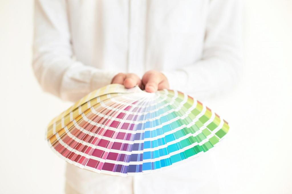
Light, Materials, and the Way We Perceive Hue
North light cools colors; west light warms them at dusk. Test swatches from dawn to night to see shifts. Choose bulbs with consistent color temperature so evening routines feel predictable, especially in spaces where calm, steady mood really matters.
A reader layered mustard velvet pillows and a rust throw onto a cool gray sofa. Conversation picked up, evening reading lingered longer, and movie nights felt warmer. She now hosts book club monthly—proof that color can invite community.
Color Stories from Real Homes
Sage walls with creamy sheers softened harsh afternoon light, helping naps become predictable. Parents noticed their own breathing slowed during lullabies. The palette traveled into a hallway, creating a gentle transition that supported bedtime rituals for everyone.
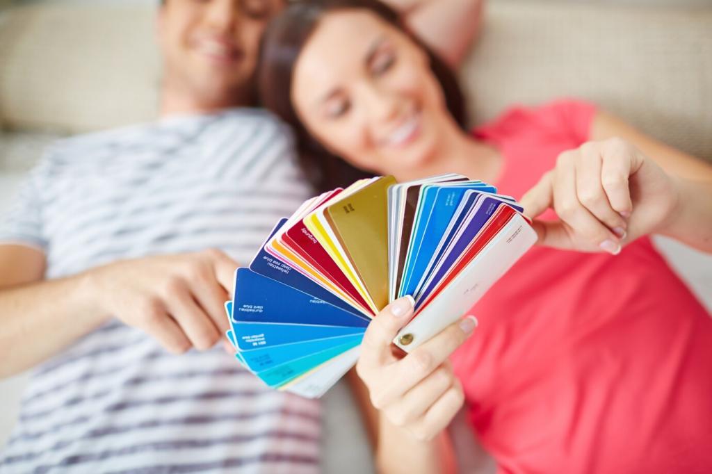
Designing a Cohesive Palette with Purpose
Choose a Base and Two Supportive Neutrals
Start with a versatile neutral that flatters your daylight, then select two supportive tones—one warm, one cool. These buffers stabilize brighter accents and help the psychology of your palette remain consistent across changing furniture and seasons.
Use the 60–30–10 Guideline Mindfully
Let sixty percent be calm background, thirty percent be supportive secondary color, and ten percent sing as accent. This simple ratio reduces decision fatigue, ensures balance, and allows emotional highlights without overwhelming the nervous system or routine.
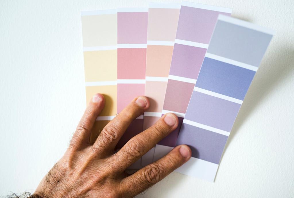
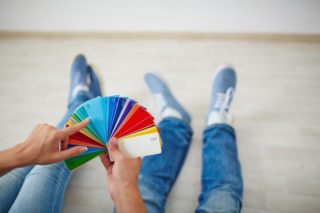
Test Big, Observe Slowly, Decide Kindly
Paint oversized swatches on multiple walls, live with them for a week, and journal how you feel morning and night. If a hue irritates you on day three, trust your body and refine until your space truly supports you.
Personality, Memory, and Color Preference
Maybe teal recalls a seaside childhood, while sunflower yellow reminds you of a treasured kitchen. When a color carries comfort, feature it deliberately. Ask family members about their memories, then weave shared hues into gathering spaces for connection.
Personality, Memory, and Color Preference
If you are sensitive to overstimulation, choose low-contrast pairings and soft transitions. Pattern scale matters, too. Calm color fields can reduce cognitive load, making daily routines smoother, especially in hallways, bathrooms, and kitchens where quick decisions accumulate.
Personality, Memory, and Color Preference
Use welcoming tones in entryways and dining areas to encourage lingering conversation. Keep private zones more individualized. Thoughtful color boundaries gently communicate social cues, supporting comfort for visitors while protecting your household’s need for retreat and restoration.