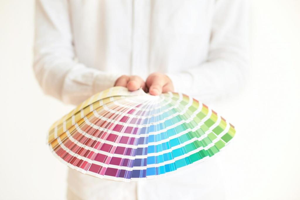
Light, Materials, and the True Color You See
Morning light cools colors; afternoon warms them. South-facing rooms intensify saturation, while north-facing spaces read moodier. Track color from sunrise to evening, then adapt palette choices to each room’s unique daily arc.
Light, Materials, and the True Color You See
Matte hides imperfections and diffuses light; satin adds gentle glow; semi-gloss highlights trim. Choose sheen by function and texture. Kitchens and baths often benefit from wipeable finishes that still play nicely with softer walls.